Warning! Trend forecast is here for Spring/Summer 2019!
With the end of the year fast approaching and the beginning of a new one not far from our minds, it’s time to get ready for the 2019 trends. We’ve compiled all the spring summer 2019 trends in color and interior design to get you inspired for another year of celebrating design!
SEE ALSO: World’s Top 10 Interior Designers That Will Blow Your Mind
Let’s start with Pantone’s selection of the best colors for Spring/Summer 2019 that you’ll be seeing everywhere from interior design to fashion. Get ready to get inspired!
Fiesta 17-1564
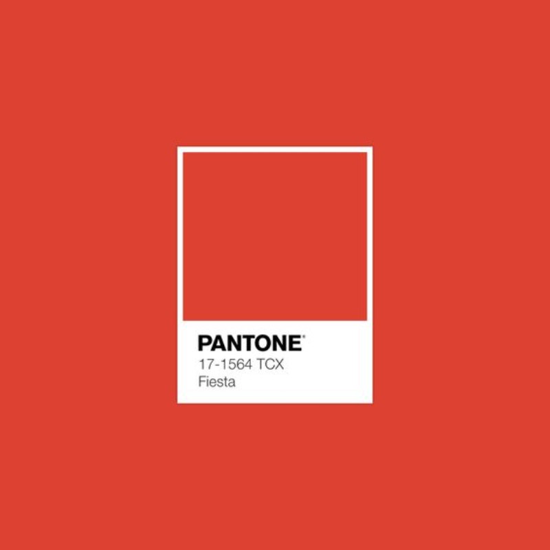
A festive orange red, Fiesta radiates energy, passion and excitement.

A*n orange such as this wonderful color by Pantone can really brighten up a room or bring that special touch you need for a specific space. In this living room, Fiesta was used on the upholstered sofa, a statement piece that is sure to leave an impression.
Jester Red 19-1862
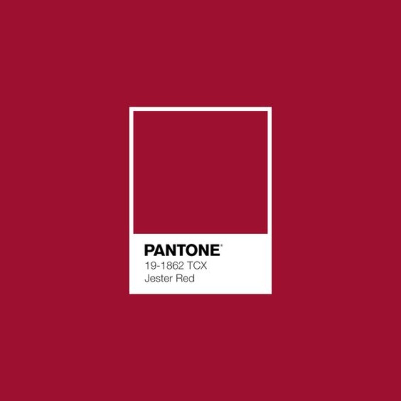
Adding depth and intensity, Jester Red combines rich elegance with urbanity.

A beautiful and deep color such as Jester Red can bring the fire to your home decor. Refinement and elegance are the main keywords when using this particular color. It can really bring modernity into your home decor.
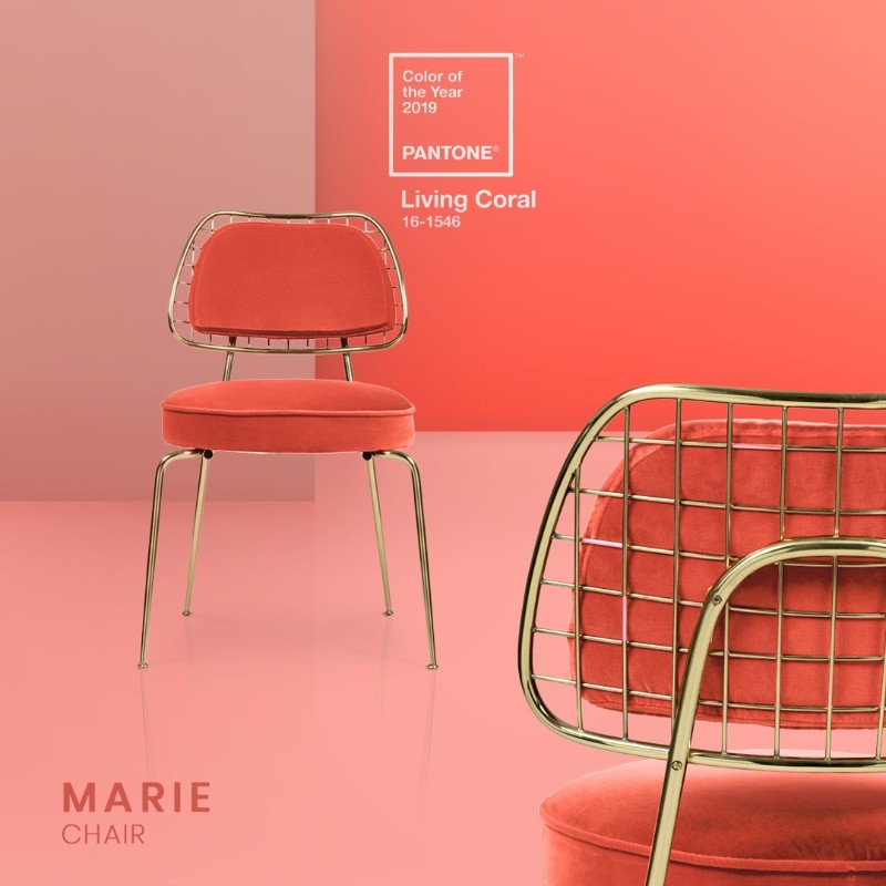
Living Coral 16-1546
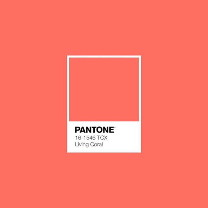
Living Coral is an affable and animating shade whose golden undertone gives it a softer edge.
Color of the year by Pantone, Living Coral is perfect on a statement piece whether it’s in your dining room, bedroom or even kitchen. A soft color such as this one is perfect for a Spring/Summer home renovation.
Aspen Gold 13-0850

Brightening our day, sunny Aspen Gold stimulates feelings of joy and good cheer.

Aspen Gold can easily be brought into your home decor in the color of your wall, fabric of your sofa or armchairs, even through polished brass on furniture pieces such as side tables. It’s a modern color with great potential!
Sweet Lilac 14-2808

An endearing pink infused lavender, Sweet Lilac’s easy and gentle manner quietly charms.

Lavender with a touch of pink can really bring identity into your home decor, a touch of something special that could be missing. It’s a modern color, vibrant and rich in its subtle way.
Toffee 18-1031
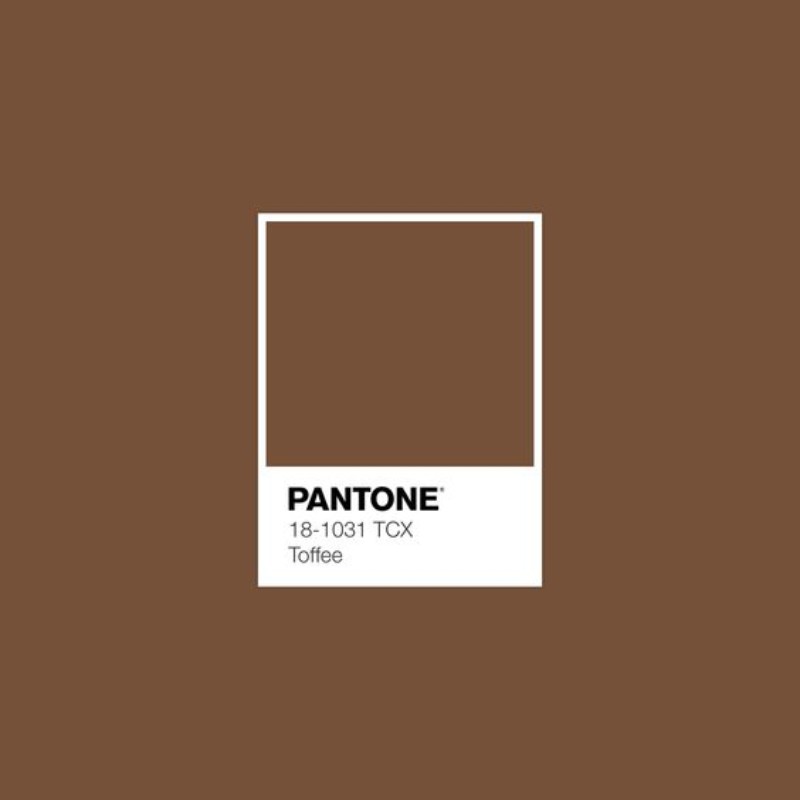
Deliciously irresistible, tasteful Toffee whets the appetite.

For a neutral, Toffee is a classic color with a rich personality that can easily be put together with lighter colors to bring the best of it.
Eclipse 19-3810

A deep blue redolent of the midnight sky, thoughtful Eclipse is both serious and mysterious.
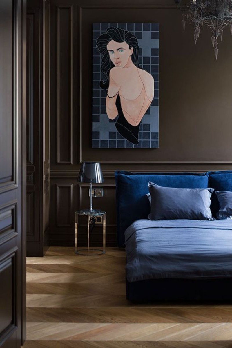
A dark deep blue like Eclipse is the perfect choice for a modern and luxury home. It’s widely used, alongside navy blue, as the perfect neutral to sober up a space and bring that touch of depth it needs.
Sweet Corn 11-0106

Sweet Corn tempts with its soft and buttery attitude.
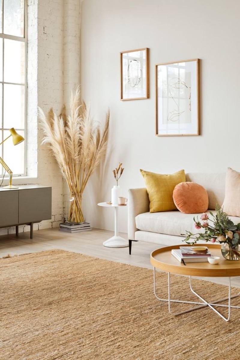
A white-ish beige such as Sweet Corn is the perfect addition to balance out a room. If you’re in search of the perfect neutral to go along with everything, Sweet Corn is for you!
Now that you know all the color trends for Spring/Summer 2019, find out some of the biggest trends in interior design that you need to apply to your home now!


READ MORE: Vintage Industrial Design Ideas For Your Loft That You’ll Love
DID YOU LIKE OUR POST? FEEL FREE TO PIN ALL THE IMAGES TO YOUR FAVORITE PINTEREST BOARD OR TO PRINT IT AND USE ON YOUR MOOD BOARD. DON’T FORGET TO FOLLOW US ON FACEBOOK, PINTEREST, INSTAGRAM. SUBSCRIBE HERE AND DON’T MISS A THING!
| |






hello
i have seen all your designs which is amazing and so unique and thanks for sharing all designs with us